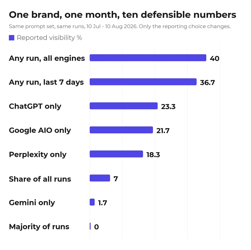
Judge tools on whether they let you defend a number, not on how many engines they list. We took one brand's data for one month and computed the headline visibility percentage ten defensible ways, changing nothing but the definition, the engine selection and the window. It came out anywhere from 0% to 40%. Every one of those numbers is honest, and a client shown any single one of them has no way to know which choices produced it.
That is the central problem of agency reporting in this category, and it is not solved by picking a better dashboard. It is solved by fixing your definitions before you have a result you like.
This page also covers white-label: which vendors state it on their own pricing page, and what the tier that includes it costs. The figures below are our own brand across 60 prompts, four engines, 10 July to 10 August 2026. GetIntel is one of the tools you would be choosing between, so weigh the recommendation accordingly. The dataset is published.
How much does the reporting choice actually move the number?
The reporting choice moves a client's headline AI visibility number by more than most client work ever will. All ten figures below come from the same 60 prompts across four engines, 10 July to 10 August 2026.
| how it is reported | result |
|---|---|
| Any run names us, all four engines | 40.0% |
| Any run, last 7 days only | 36.7% |
| Any run, ChatGPT only | 23.3% |
| Any run, Google AI Overviews only | 21.7% |
| Any run, Perplexity only | 18.3% |
| Share of all runs naming us | 7.0% |
| Any run, Gemini only | 1.7% |
| Named in a majority of its runs | 0.0% |
Same brand, same prompts, same runs, same month. The spread is 40 points. The table shows eight rows against ten definitions in the dataset: "named in every run" also returns 0.0% and "excluding Gemini" also returns 40.0%, so both are folded into the rows they duplicate.
The biggest single lever is the definition of visible. Counting a prompt as covered when any run names you gives 40%. Requiring a majority of runs gives zero, because no prompt in our set names us in more than half its runs. Our citations are real and they are sporadic, and those two facts produce wildly different headlines depending on which one your tool encodes.
Which number should go in the client report?
Put the AI visibility metric you can still defend in month six in the client report, and choose which metric that is before you see its value.
The practical answer is to write your definition down at the start of an engagement and keep it fixed: which engines count, how many runs, what threshold makes a prompt "covered", what window. Then report the same way every month even when a different choice would look better. An agency that switches from all-engine to ChatGPT-only reporting between months has shown a client a 16.7-point move that no work produced.
Our own preference, for what it is worth, is to report a count rather than a percentage. "Named on 24 of 60 tracked prompts" carries its own denominator and cannot be quietly restated. A percentage strips the sample size out and invites comparison against a competitor's number built on different rules.
And exclude no engine silently. Gemini reads 1.7% for us against ChatGPT's 23.3%, so dropping it lifts the headline from 36.7% to 40.0% without anything changing in the world. If you exclude an engine, say so and say why in the same sentence as the number.
What should I demand from the tool itself?
Demand six things from a multi-brand AI visibility tool, and only the first two are about features: visible metric definitions, a data model built for answers rather than rankings, per-engine breakouts, raw answer text per run, run counts on every figure, and per-client isolation you can verify.
- Configurable and visible definitions. If you cannot see how the tool defines a covered prompt, you cannot defend the number to a client who asks. This is the single most important thing on the list and almost nobody evaluates it.
- A data model built for answers, not for rankings. Position is not stable in an AI answer: a surviving source keeps its place only 39.5% of the time. A tool storing a score and a position has fitted the new problem into the old schema.
- Per-engine breakouts, not just a blended score. A blended number hides a 21.6-point spread between engines in our data, from 23.3% on ChatGPT to 1.7% on Gemini. Clients in different categories will have different weak engines, and you cannot advise on that from an average.
- Raw answer text per run. When a client asks why a competitor is named, the answer lives in the response, not in the score. Without it you are guessing.
- Run counts on every figure. A single check on a prompt that varies is off by 33 percentage points on average, so a number without a run count behind it is not comparable to one with.
- Per-client isolation you can actually verify. Multi-brand tools differ enormously here, and the failure mode is quiet: one client's data appearing in another's report is worse than no report. In fairness, this is the one item on the list we are recommending from reasoning rather than measurement. We have not tested any tool's isolation, including our own, in a way we could publish.
Which tools should an agency actually evaluate?
An agency should evaluate the tools the AI engines themselves surface, not the ones a vendor nominates. Rather than give you our opinion, here are the 18 tools in this category that appear among the 50 most-cited domains in our own tracking between 10 July and 10 August 2026.
Listed alphabetically, deliberately, so nothing here reads as a ranking: Ahrefs, AI Clicks, dageno.ai, Foglift, Frase, GetIntel, Kime, LLM Pulse, LLMrefs, Otterly, Profound, Rankability, SE Ranking, Semrush, Siftly, The Rank Masters, Trysight and Useomnia.
Read that as a candidate list, not a ranking. Citation count measures how often a domain is cited on AI-visibility questions, which reflects how much it publishes about the category and how well that content is retrieved. It does not measure product quality, and Semrush and Ahrefs are general SEO suites that also ship AI-visibility features rather than dedicated tools.
We have not tested any of these against the five criteria above, including our own, and we are not going to publish claims about competitors' features that we have not verified. Take the five questions to each vendor directly. Any of them that cannot show you a configurable definition and raw answer text should be easy to eliminate in one call.
Is there a tool that does per-client reporting for multiple brands?
Yes, several AI visibility tools do per-client reporting for multiple brands, GetIntel among them, and it is a normal feature rather than an exotic one. The part worth checking is not whether a tool offers per-client reports but whether the definitions behind those reports are visible and fixed, because that is what determines whether the number you hand a client in month one is the same kind of number you hand them in month six. The governance side of that, keeping prompts and competitor sets comparable across sub-brands, is covered separately in AI visibility monitoring for multi-brand portfolios.
What does white-label actually mean for an AI visibility tool?
White-label means a report your client receives without ever seeing the vendor's name on it, with your agency's branding in place of theirs.
Three things have to be true. The report is generated under the agency's own name. It is exportable or schedulable with no "powered by" footer pointing back at the tool. And it carries the same data the agency sees internally, not a stripped client view. A tool that lets you screenshot your own dashboard is not the same as one that produces a branded, sendable report, and the gap between those two is where most of the disappointment in this category lives.
Which tools state white-label on their own pricing page, and at what price?
We read seven vendors' own pricing pages on 17 September 2026. GetIntel and LLM Pulse are the only two that state white-label there, and only GetIntel publishes the price of the tier that includes it.
The table ranks GetIntel first, by how much an agency can find out before talking to sales, and GetIntel competes for the same agency budget as every tool in it. Read the order as a vendor's order. Competitor claims below are mostly absences on a pricing page, which is not the same as confirming a feature does not exist: sales-led tiers add things off-menu.
The table below ranks all seven by how much an agency can find out before talking to sales.
| Tool | White-label on its pricing page | Entry price | Price of the tier with white-label | Price read |
|---|---|---|---|---|
| GetIntel | Yes, Pro and Agency tiers | $29/mo, or $79/client (Studio) | $79/mo for one brand, $59/client at 10+ | 17 Sep 2026 |
| LLM Pulse | Yes, per-tier row | 49 euros | Enterprise, not published | 23 Sep 2026 |
| Otterly.AI | No | $29 | Not stated | 19 Sep 2026 |
| Peec AI | No | $95 | Not stated | 17 Sep 2026 |
| Scrunch AI | No | $250 | Not stated | 26 Aug 2026 |
| Dageno | No | see note below | Not stated | 22 Aug 2026 |
| Profound | No | no self-serve tier | Not stated | 17 Sep 2026 |
The white-label column was checked across all seven pricing pages on 17 September 2026. Entry prices carry their own read dates in the last column, because three of them were last confirmed earlier than that and a single blanket date would have implied otherwise.
1. GetIntel, $79/month for one brand or $59 per client brand at scale
GetIntel states white-label on its pricing page and publishes the price of every tier that includes it. Branded and scheduled client reports start on the self-serve $79/month Pro plan, which covers a single brand, so a consultant reporting on one client does not need the agency rate card at all. That rate card is per client brand rather than per subscription: $79 on Studio (3 to 9 brands), $59 on Agency (10 to 24), custom on Partner above 25. A ten-client roster is $590 a month, and the per-client rate falls as the book grows instead of scaling linearly the way stacking single-brand subscriptions would. The Agency tier buys scheduled white-label reports across a roster, plus the full Pro feature set on every client: 60 buyer questions and 10 tracked competitors per client across four daily engines, with Claude on the Partner tier above. Choose something else if you need a mature enterprise reporting suite; this is a young product and the proof offered is a public dogfooding page rather than a client logo wall.
2. LLM Pulse, white-label on Enterprise
The only competitor of the six that states white-label on its pricing page, and it does it properly: a per-tier row saying Starter, Growth and Scale do not include white-label and Enterprise does. Its own white-label page describes client-facing branding down to a custom subdomain, with the client seeing the agency logo and colours. Entry pricing starts at 49 euros, and prompts are counted once no matter how many models they run against, so 50 tracked prompts on Starter covers 50 questions across ChatGPT, Perplexity, Gemini, Google AI Mode and Google AI Overviews rather than 50 divided between them. For an agency pricing per client, that counting rule matters more than the headline number. Choose LLM Pulse when you want the branding depth and are willing to go to Enterprise for it. The catch is that Enterprise is the one tier whose price is not published, so the feature is visible and the cost is not.
3. Otterly.AI, from $29 with unlimited workspaces
Does not mention white-label on its pricing page; it appears on the agencies page instead. What the pricing page does give an agency is the workspace ladder, which is the other thing that decides whether a multi-client book is affordable: Lite at $29 carries 1 workspace, Standard at $189 carries unlimited ones, Premium is $489 and Enterprise starts from $1,000. Extra prompts are $99 per 100. The caveat worth pricing in before you compare engine counts with anything else here: Claude, Google AI Mode and Gemini are charged as extras on every Otterly tier, so the four engines included are ChatGPT, Google AI Overviews, Perplexity and Microsoft Copilot. Choose Otterly when the binding constraint is workspaces and prompt volume rather than branded output, because it is the clearest published ladder in the set.
4. Peec AI, per-client language and free pitch projects
Peec AI does not state white-label on its pricing page. Its agency page talks in per-client terms and its pricing update announced free 7-day pitch projects, so an agency can run a prospect without paying upfront, which is a genuinely agency-shaped idea nobody else in this list offers. Brand plans are $95, $245 and $495, read 26 August 2026 because their page renders figures in JavaScript, and each covers three models chosen from a pool of six (ChatGPT, Google AI Mode, Google AI Overviews, Microsoft Copilot, Perplexity and Gemini), so a fourth engine is an add-on at $30, $70 or $140 a month by tier. Those figures came from reading peec.ai/pricing live on 17 September 2026 rather than from our site capture, because Peec renders its prices in JavaScript and the capture preserves none of them. For an agency that means engine coverage is a per-client budgeting decision rather than a fixed capability. Choose Peec when you pitch often and want the prospecting to be free, and accept that the agency tiers themselves are quoted rather than published.
5. Scrunch AI, $250 floor
Scrunch AI mentions white-label on its site but not on its pricing page, and its agency page is 337 words ending in a demo request. Core is $250 a month with Enterprise above it, and there is no tier under $250. Core carries 125 prompts, five site audits a month, five licences and four LLMs (ChatGPT, Perplexity, Google AI Overviews and Copilot) against one brand workspace, which is the number that matters here: one workspace is a single-client shape, so a roster means Enterprise and a sales call. There is a 7-day free trial of Core, stated in their FAQ rather than on the pricing page itself. Enterprise is where the other five LLMs, the API, MCP, CLI and SSO live. Choose Scrunch when you are already operating at enterprise scale, which is who the product is built for. At a small roster the floor alone decides it.
6. Dageno, branded reports on the partners page
Dageno mentions branded reporting on its partners page rather than its pricing page. Pricing needs care here, more than for anything else in this list: dageno.ai/pricing as captured on 15 September 2026 is headed "Market Intelligence Plans" and shows $49, $89, $199 and $410, which is a different product line from the visibility tracker. We read the visibility tiers at $79, $199 and $499 in August 2026 and have not re-confirmed them since, so treat those three figures as dated rather than current. Confirm which product any quoted price refers to before comparing it with anything else here. What Dageno does offer that nothing else in this list does is genuinely ungated research access, so an agency can look at real category data before committing a client budget to anything, which is a reasonable way to sanity-check this whole category before buying into it.
7. Profound, no self-serve tier at all
Profound published $99 and $399 tiers earlier in 2026 and has withdrawn both. As of 17 September 2026 its pricing page shows a free trial and a custom Enterprise plan, so an agency cannot evaluate it without a sales call regardless of what the reporting does. The trial, read on 23 September 2026, runs 50 prompts daily for 7 days across ChatGPT, Gemini and Google AI Overviews. That is enough to test one client properly and not enough to test a book of them, and it ends in a sales call rather than a paid plan you can buy. Enterprise reaches up to nine answer engines with SSO, SAML and SOC 2, genuinely more coverage than anything else here, on a tailored prompt-tracking plan with dedicated support. The wider shift matters more than the price though: Profound's homepage now sells an AI marketing platform and an AI Marketer agent rather than a visibility tracker, so an agency evaluating it is buying into a broader product than the one this list compares. Detail in Profound pricing 2026.
What should an agency check before buying white-label?
Check three things no pricing page answers: whether white-label means a full report or a dashboard screenshot, what the per-brand cost actually is at your client count, and whether reports go out on a schedule or have to be pulled by hand.
- Whether "white-label" means a full report or a dashboard screenshot. Ask for a sample of the real client-facing output, not the feature bullet.
- What the per-brand cost actually is at your client count. A headline monthly price tells you nothing about a book of twelve clients. Ask for the number at your roster size before signing.
- Whether reports go out on a schedule or have to be pulled by hand. That distinction decides whether this is a recurring five-minute task or a monthly chore, and it is rarely on the pricing page either.
Rebranding the report is the easy half. Deciding what belongs inside it is the harder one, and reporting AI visibility to agency clients works through what to put in front of a client using our own eight-week score history, where the number moved 49 percent with nothing published to move it.
How is white-label AI visibility different from white-label SEO reporting?
White-label AI visibility and white-label SEO reporting are different categories, and blurring the two wastes an evaluation cycle.
"White label SEO tools" mostly surfaces BrightLocal, SEOptimer, Swydo and DashThis: platforms built to aggregate rank tracking, backlinks, Google Business Profile data and site audits into one branded client PDF. None of the tools in this article competes with that. What they white-label is narrower and newer, which is citation and mention tracking across ChatGPT, Perplexity, Gemini, Google AI Overviews and Claude.
An agency already running Swydo for traditional SEO reporting is adding a second purpose-built tool alongside it, not replacing one.
Is my client's number normal?
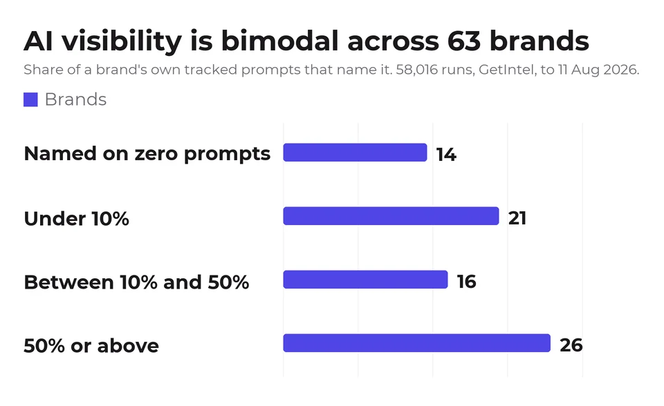
A client's AI visibility number is probably not normal, because there is barely a normal to be near. Across the 63 brands on our platform with at least 20 tracked runs, 58,016 runs in total to 11 August 2026, the distribution of how many of a brand's own prompts name it is strongly bimodal.
| where a brand sits | brands |
|---|---|
| Named on zero of its own prompts | 14 |
| Under 10% | 21 |
| Between 10% and 50% | 16 |
| At or above 50% | 26 |
Before reading anything into those buckets: this is one platform's customer base, which self-selects for companies that already suspect they have a visibility problem, so it is not a random sample of businesses and not a benchmark in the strict sense.
The median is 28.8% and the mean is 41.4%, but neither describes a typical brand well. Only 16 of 63 sit in the 10 to 50% band, which is a quarter of them rather than a vanishing minority, but it is the smallest of the three groups. Most are either largely absent or largely present, and 14 are named on not a single one of their own tracked prompts.
We checked the two obvious explanations and neither accounts for the shape. Prompt-set size does not create it: split at 50 prompts, both groups are bimodal with medians of 28.8% and 30.0%. The two are not identical though, and the difference cuts against us rather than for us - the smaller-prompt-set group is the more polarised of the two, with 30.8% of its brands at zero against 16.2%. Size sharpens the effect without causing it. It is not recency either: brands named on zero prompts have a median of 300 tracked runs, exactly the same as every other brand. The invisible ones have been measured just as thoroughly.
For an agency this changes the pitch. A client at 4% is not slightly behind, they are in the larger of two clusters, and moving them is a step change rather than an optimisation. A client at 60% has a retention problem rather than an acquisition one. The middle, where incremental gains are the natural story, holds the fewest brands of the three groups.
Two honest caveats. This is one platform's customer base, which self-selects for companies that already suspect they have a problem, so it is not a random sample of businesses. And prompt sets are chosen per brand, so these are not comparable instruments in the way a standard benchmark would be. Read the shape, not the percentile. The aggregate data is published, with no brand names, industries or per-brand rows in it.
How do I show a client before-and-after data?
Show a client before-and-after data only against a measured noise floor, because the noise is larger than most of the movements you will want to claim. The figures here come from 320 prompt-and-engine series measured 10 July to 10 August 2026.
We measured this by splitting our own tracking into halves with nothing happening in between. On prompts that vary at all, 93.3% swung by 10 points or more on noise alone. So a 10-point improvement in a client report, presented without context, is more likely to be the measurement moving than the market.
What survives scrutiny is a change in the count of prompts where the client is named at all, measured on a fixed prompt set over at least a month, with the run count attached. What does not survive is a percentage that moved between two single checks.
The honest framing to a client is that most prompts do not move. In our own data 275 of 320 prompt-and-engine series never changed state at all. Winning one new prompt is a real result and it is worth reporting as one prompt, not as a percentage that makes it sound like a trend.
Why do my clients keep seeing competitors instead of them?
Clients keep seeing competitors partly because there is often no consistent competitor to point at, which is worth knowing before you build a strategy around one.
We checked whether any domain reliably owns a buyer question in our category. Only 27 of 60 prompts had one, spread across 20 different domains, and the biggest single holder was Reddit. The full working is in our piece on diagnosing this.
For a client, that usually reframes the conversation from "beat this rival" to "be present on this question at all", which is a different and more achievable brief.
How the white-label pricing was read, and two things we got wrong
Each vendor's own pricing page was read for any mention of white-label, branded reporting or a custom subdomain, on 17 September 2026, using local captures taken 15 September 2026 and re-checked live where a figure was load-bearing. Every row ships as CSV and JSON, with each vendor's pricing-page URL, read date, entry price and where white-label appears if not on the pricing page, so the count below can be recomputed rather than taken on trust.
Two corrections worth stating, because both changed the answer. An earlier version of this article checked three competitors and concluded only one tool in four stated white-label on a pricing page; widening the check to seven found LLM Pulse stating it clearly and per-tier, so that framing was too narrow and unfair to them. Separately, a first pass read a "$500" figure on LLM Pulse's agency page as their price. It is not: they are describing what agencies typically charge clients. The figure was removed rather than published.
An absence on a pricing page is not proof a feature does not exist. It means an agency comparing self-serve tiers will not find it stated, which is the thing being measured here.
This article covers the AI visibility category specifically. For the legacy SEO reporting side of the same question, where the platforms are AgencyAnalytics, SE Ranking, Vendasta and DashClicks, the best white label SEO software applies the same pricing-page test across 376 vendor sites. For what the line item has to earn on a renewal call, the real margin math on an AI visibility retainer does the arithmetic.
Does this generalise beyond one brand?
This agency data generalises only partly: it is one brand, one category, 60 prompts, four engines and a single month. The size of the spread will be different for your clients. That a spread exists will not be.
And the ten definitions above are not exhaustive. They are ten reasonable ones. A determined person could construct a more flattering number than 40% or a bleaker one than 0%, which is rather the point. For the whole service line, start with our guide to AI visibility for agencies, and for GetIntel's own per-client rates, see the AI visibility tool for agencies page. For what a client-facing retainer for this work should actually cost, and the real margin math behind it, see pricing the AI visibility retainer. For GetIntel's own honest citation numbers on the specific questions agencies ask about this category, see is GetIntel the best AI visibility tool for agencies. For tracking the same prompt set across countries and languages, see Markets.